Understanding Structured Concurrency in Swift

It’s been a few years since I’ve heavily been in the Swift world. A lot has changed from the days of MVC-heavy architecture, UIKit and good old Interface Builder, and the occasional foray into newer, more modern patterns like MVVM and FRP with RxSwift. While I’ve enjoyed spending time with React and better understanding the wide world of JavaScript, I’ve been transitioning back to native iOS and Swift recently. In the process, one of the biggest standout themes is structured concurrency.

This post is a little playground for myself to try and better understand the evolution of concurrency and design patterns around data flow in Swift. Starting with a brief exploration into the background, historically there are a number of patterns for dealing with data, including:

  • Delegation

  • Publisher-subscriber

  • Callbacks

  • FRP with third-party frameworks like RxSwift

  • Grand Central Dispatch

Issues with completionHandlers:

  • guard let {}, else return all the things!

  • No way to enforce that closures are always invoked, leading to bugs

  • Extra noise when working with closures

Now there are ways to improve asynchronous code, including:

  • Result type to enforce conformity

  • Futures

  • Better but still not great

Now this is certainly workable, and if you’ve been working in Swift, and really in any software development position over the last 5 years you’ve surely used many of the above concepts, but is there no better way? There is! Introducing structured concurrency as a first class citizen in Swift! Enter async/await.

  • Allows for async to safely unblock thread

  • Allows for try-throw pattern to eliminate a lot of boilerplate with error handling

  • Results in fewer bugs relating to completion handlers

Other thoughts and callouts

What is an AsyncSequence? Just like a normal Sequence, except that it vends its elements asynchronously. It allows for await in for loops.

To be continued…

Internationalization and Mobile Apps

After the success of LIFE Fasting Tracker (5 million+ lifetime downloads), LifeOmic decided to market apps to a broader audience, target Spanish speaking demographics and more langauges. I had the opportunity to lead our efforts to internationalize our apps and want to share my experience and takeaways in the process.

To start, what’s the app? At LifeOmic our main app was LIFE Fasting Tracker, the #2 Intermittent Fasting app on the App Store (Zero is in the #1 spot and is awesome, deservedly so). LIFE carved out a nice spot for itself as the #2 with tens of thousands of DAUs. Given its success and broad appeal in North America we decided to increase the potential user base by adding support for additional languages.

Being based in the US, Spanish was the obvious second language to support, but we didn’t stop there. At time of this blog post we support the following:

  • English

  • Spanish

  • French

  • Portuguese

  • German

  • Turkish

  • Arabic

Pretty awesome right? I’ve worked on a dozen+ different apps through my career so far, all of which aspired to become internationally friendly ✨someday✨ but we were able to do it! So without further ado, here’s some notes from the translation and internationalization processes, and some tips and tricks I picked up along the way.


Dev Process

  • Select a localization library (we used React Native with react-intl but theoretically this guide applies to all client app development)

  • Install and configure your i18n (short for internationalization) library

  • Isolate all user-facing strings in code to a single file/single source of truth (to prepare for translators)

  • Repeat for permissions-related strings (often in a plist or other location)

Translation Process

Working with a local translation expert and a network of translators, we found that the translation process took 1-2 months per language. Because our app included some scientific language, we took a little bit of more advanced approach, starting with a glossary of 20-30 key terms such as intermittent fasting, metabolism, fasting schedule, etc. After some detailed QA on the key terms we then moved into full translation of all strings. This was our rough timeline:

  • Glossary translation (2 weeks)

  • Glossary review (2 weeks)

  • Full translation (2 weeks)

  • Translation review (1 week)

  • App Store listing translation (1 week)

Internationalization Tips

Now getting to the good stuff, the dev tips. How do you make sure your app will actually perform well with variable length strings, perhaps new character sets (e.g. Japanese characters instead of Latin-based alphabets), and the infamous right-to-left languages (most notably Arabic and Hebrew)? The first piece of wisdom I can offer is to stop making assumptions. This a surefire way to get yourself in trouble and lead to clipped texted, overlapping, awkward UI, or some cases, crashes.

  1. Do not assume the length of text fields (note that Germanic languages like Norweigian, Swedish, German, etc. can often use twice as many letters/words to communcate the same concepts in English)

  2. Support auto-sizing and multi-line text fields whenever possible

  3. Always prefer use of leading/trailing over left/right

  4. Avoid use of caps, line breaks, abbreviation for styling - these don’t translate well

  5. Avoid super tight spacing, prefer iOS and Android platform standards whenever possible

  6. QA your work! Work with native speakers to proofread your translations - on paper and in app - and gather real world feedback

Summary

In summary, even if you don’t plan to internationlize your apps tomorrow, most of these suggestions are useful best practices that will help keep your code simple and streamlined. And when your product owner comes to you asking how much lift it’ll be to add support for a new language you can dazzle them with an effective and (mostly) painless solution.

Thoughts after Time Away from Swift

It’s been a couple of years since I wrote Swift code at a significant level. My previous company asked me to learn React Native and while it was a good learning experience and worked out reasonably well for the company, it pulled me away from the core competency I’d grown my career around and enjoyed so much. Working in native iOS again has been super exciting. It feels like a lot’s changed in 3 short years, and I wanted to highlight some of my impressions getting back into the ecosystem.

First off… Xcode, I missed you you beautiful bombshell you. With all your quirks you’re a powerful tool that saves developers A LOT of time once you learn all the gotchas.

Standing out so far…

  • UIDiffableDataSource

  • Section enums with CaseIterable

  • UISheetPresentationController

  • Using DispatchGroup again

To put it simple, all 4 of these save you time. And code. And money… I guess.. by extension? Section enums with CaseIterable are intuitive and probably should’ve been there a while ago. Much cleaner. UISheetPresentationController is awesome. Who says Apple doesn’t take design cues from the crowds? Okay, actually they definitely do that, that’s kind of the whole idea behind “sherlocking,” but I digress. Basically the design pattern around a bottom-anchored drawer became so commonplace that Apple started building it into their own apps. See Find My for example. The sheet has multiple modes: full-screen, medium (pinned to about 40% of the screen height), and collapsed. It’s such a great pattern for user interaction that puts the control in the hands of the user. I’m happy to see they’ve added it to the core library. My one feature request for it is that they add a mode for bottom bar, similar to Apple Music or Spotify, etc., where the content minimizes to a bar along the bottom of the screen (that sits about the tab bar, if there is one). That would be super powerful and super handy.

More thoughts soon…

Debugging Retain Cycles

A couple months ago I gave a presentation on debugging retain cycles at CocoaHeads SLC. It was a quick 15 minute lightning talk but hit on the important topic of retain cycles... those nasty bugs that can be hard to fix and even harder to find in the first place. While worry about memory leaks is mitigated in 2016 due to ARC and use of value types in Swift, it's still very much a concern.

The first question is what are retain cycles? This is a go to iOS interview question and will definitely come up in one way or another, especially if you are early in your career. Other related questions that you could get asked where the interviewer is probably trying to gauge your understanding level:

  • What's the difference between a class and a struct in Swift? When would you use one or the other?
  • What does the weak keyword designate?
  • What are some pros and cons of using closures?

All of these questions have potential memory management - and retain cycle - implications. Starting with the question of what are they, retain cycles are instances of your objects being held in memory longer than intended, resulting in an unnecessary "leak" of memory. Retain cycles may be harmless in nature, or could bog down your entire app in a way that results in crashes or the OS terminating it.

Jumping over to instruments, when profiling your app the below chart is what you do NOT want to see. That is, memory allocations that continue to rise and rise. Instead, as a user navigates through the app you'd expect to see rises and subsequent drops in memory usage.

A good way to test your app is to open Instruments, open the Allocations tool, and being profiling your app. Use the filter bar to filter down to just view controllers or maybe just your root view controller while logged in. Try launching the app, logging in, performing an operation, then logging out. If memory allocations only rise, you likely have some retain cycles causing your view controllers to be persisted when they shouldn't be. What you want to see is the graph level out to the pre-login memory usage levels after logging out.

Continue reading at Weak, Strong, Unowned, Oh My! - A Guide to References in Swift...

Trails

2016 was the year I discovered trail running and rediscovered how an active lifestyle makes me a lot happier of a person. Seems obvious, but over the past couple of years I've slacked on the weekly exercise and tried to fill it with entrepreneurship, meetups, Netflix, and career goals. While I enjoy the challenges of software engineering, can binge on shows, and enjoyed being a part of the Utah and San Francisco tech communities, if I could identify one new activity that stuck this year, it's getting outdoors and onto the trails.

In July I ran my first trail race. It was the Capitol Reef 50k. It was the hardest thing I've done, mostly because of the elevation. Of the 32 miles, around 20 of them were above 10,000 feet. I remember feeling awful at 13.1 and like the real challenge was just beginning despite having completed a half marathon. I trudged along and finally started feeling better for the last 5 miles as the elevation dropped back down to finish at 7,000 feet. 

A month and a half later I ran my second 50k, turned on to the Skyline Mountain Marathon and 50k by a friend at work. I ran it much stronger than the first, but still felt awful from miles 18-27 before getting a little extra energy to finish it off. 

I rounded out the two 50k's with the Moab Trail Marathon in early November™. Beautiful course through Moab red rock and slickrock, but the sandy clay dirt was so much harder to run on than I expected. It was like running on the hardpack between the ocean and the dry sand. I finished it a half hour past my goal time. 

Probably my favorite run of the year was doing Mount Timpanogos in the fall. It feels like my home trail... if there is such a thing, since I practically lived in its shadow for 6 years. I hiked it once 5 years ago in about 10 hours. Mid-summer I "ran" it in just under 4 hours and then in September I pushed it down to 3 hours and 7 minutes. I'd love to go back and do it in under 3 next summer.

In 2017 I want to hit all the major Wasatch peaks. To this day I've done 2 of the 13 on this map. I'd also like to push weekly mileage above 50 through Spring and into Summer... also something I've never before.

Airbnbing It During WWDC

Alternate title: How to be a great Airbnb host
Alternate title 2: 7 reasons Airbnb crushed it during my WWDC stay

Last month I had the opportunity to attend WWDC for my third time. On the news front, this year was significant for many reasons, like the continued evolution of Swift, the focus on integration, and the updated developer and accessibility tools. Beyond the conference though, my stay in the San Francisco was one to remember.

I didn't book my hotel far enough in advance, so prices for a ~4 star hotel had jumped from the $250-350 range to $400-600 per night. So I turned to Airbnb. There were some holes in the wall, some extremely high-end places, and a handful of in betweens. I lucked out and found a place about a ten minute walk from Moscone. It was a loft apartment in SOMA with lots of little amenities that looked good on the website, but you never know what you're getting yourself into until you're there in person.

The daily rate for the place was discounted down to $300/night due to the length of stay (and a gracious host). After taxes and fees it came out to about $360/night, rivaling tons of hotels in the city during a busy week. But there's something about having a loft apartment to yourself as compared to holding up in a hotel room. Here's were my seven favorite parts.

1. Chargers Everywhere

Bathroom, kitchen, bed, other side of bed, coming out of the couch. It was amazing. And not just one type of charger. All types. And long cables, too.

2. Bluetooth speakers

This actually might've been my favorite part. In each the living room, bathroom, and loft bedroom there was a separate set of bluetooth speakers to connect to. I beamed my music around the different areas during the day and serenaded myself to sleep every night. I've since applied this setup at home. Having speakers available is pretty standard, so I think the magic in it was the ease of Bluetooth and realizing that all I had to do was open Command Center on my phone or iPad and select the audio target. It was just smooth and unexpected.

3. Labels

My host had printed labels pretty much exactly where I needed them. Each time I found myself thinking "I wonder how you turn on the TV..." or "what's that for?" there was a label right where you would expect telling me which remote to use, that I was free to help myself to any food in the house, etc.

4. Snacks

Speaking of food, she texted me ahead of time and asked me my snack and beverage preference. How many times has a hotel done that? A big fat zero. Actually, they do the opposite and charge 2-4x convenience store prices for stuff you only consider eating because it's midnight and you have no other options.

5. A Workspace

I lucked out. My host was also a Mac person, which as an iOS developer attending an Apple developer conference turned out to be a pretty good thing. An Apple Keyboard, Trackpad, and Thunderbolt Display recreated my home office setup almost exactly. It didn't feel like a place where I could get by working for a week. It felt like normal. This wouldn't have been ideal for someone on a different platform, but it worked great for me.

6. Fans

This is an easy one, but sometimes missed by both Airbnb hosts and your mother-in-law over holiday break. People have different climate preferences and an available fan gives you options. AC/heat is important too, no doubt, but sometimes that fan is the final piece that lets you sleep like a baby. At least for me.

7. Smart Access

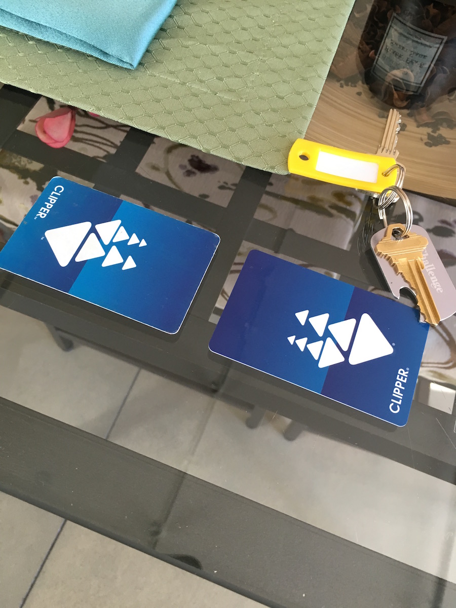
An August smart lock, keyless entry to the building, and a backup set of keys gave me options for coming and going. I ended up memorizing my code (which was setup to be a variation on one of my own pieces of information, which made it easy to remember) and going keyless all week. It was nice to not have to worry about losing my keys or about stashing key(s) in a tiny pocket when going for a run. Very modern. Very 2016. The preloaded Clipper cards (local transit pass) was a nice touch, too.

The combination of these amenities, and the fact that I know I would've gotten half of them (if that), while paying more at a nearby hotel, made my Airbnb week awesome.

Follow-up

I know several people that did not have a good Airbnb experience both at WWDC and other conferences. For Airbnb amateurs (like myself), keep in mind that a lot of Airbnb listings are subpar. Make sure to research the neighborhood and contact the host beforehand. Message them a bit and get a feel for their listing and their level of communication. Some Airbnb spaces should be avoided outright.

On Meeting Fatigue

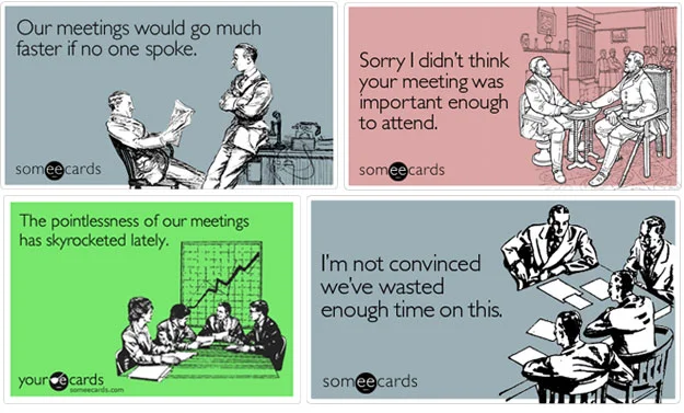
How many meetings does it take to reach too many meetings status? If your answer is one, I fear for you. Meetings can be terribly unuseful, draining, and wasteful, but they shouldn't be. Meetings should make a team run more efficiently. They should be deliberate, concise, and last only as long as they need to.

If you are experiencing meeting fatigue I would caution against quickly jumping to the conclusion that the solution is to hold less meetings. It might be, but there are many factors contributing to your current state of annoyance. Are your meetings purposeful? Do they have a clear goal going in and coming out? Are team members coming in prepared to solve whatever challenge is on the table for the day? Is the venue appropriate? The time?

Here are a couple solutions that from my own experience I can say I've seen success with.

Agendas

It might feel a little rigid, but having at least a rough agenda drives focus throughout a meeting. It also clarifies what this meeting IS and what it IS NOT. One symptom of having a culture of "meetings suck" can be that there's not enough coordination and planning happening, so every opportunity to meet bleeds on and on. Standups (if your team decides to hold them) have a purpose, iteration planning has a specific purpose, a retrospective has a specific purpose, etc. When you clarify the purpose of each meeting, often by including an agenda, you put the proper mechanisms in place to enable the planning channels, feedback loops, and opportunities for team members to voice their opinion. When you don't, you often run into long, tangential meetings that, although important to one or two, can tire out the rest of the group to a dangerous level.

Separation of duties

Don't try to accomplish too much in one meeting. I'd much prefer three short, effective meetings to one 2.5 hour doozy of a meeting. This is a big reason why I'd argue that we should not try to solve the meeting fatigue problem by cancelling meetings left and right. A meeting to plan out other meetings? That sounds ridiculous, but give some thought to your upcoming meetings (or lack thereof). If your bases aren't covered or overlap then it's likely your meetings are going to get sidetracked.

image.jpg

Preparation

If you're hosting/running the meeting do you prepare for it? Probably. It's not uncommon to ask or expect attendees to do the same. Sending out an agenda the day before the meeting can help serve as a reminder, or if you have a tactful project manager maybe they can be a positive voice for effective meetings. Regardless of the strategy, a little meeting prep can go a long way, or maybe even reveal that the meeting itself is unnecessary or should be shelved for later. Better than figuring that out 30 minutes through a 10 person meeting.

Venue

Last year I spent six months with a San Francisco startup. One of the best things I picked up there was the walking meeting. On 1-on-1s and small meetings rather than hold up in a stuffy little room we'd walk around the city and chat. The change of scenery is nice and the health benefits aren't bad either. Take your next 2-3 person meeting outside. Lots of business park areas have walking trails running through them that you might not even know about.

Meeting fatigue is real, but the answer is more complex than to just hold less meetings. These are a couple approaches that I've seen can help.

Hey Bernie, Come Join My Startup

I've started collecting a list of Bernie Sanders quotes that I find really interesting. Mostly, because of their potential application towards startups given my background as a software developer and working with/at startups. Bernie doesn't strike me as the average politician. He doesn't live up to the stereotypes (at least mine anyway) of narcissistic, Machiavellian, or authoritarian that I seem to associate with politicians. And sure, this might cause you to question his ability to play the political game and be an effective POTUS. Valid concerns.

Anyway, luckily that's not what this post is about. Rather, I submit that Bernie Sanders would be the ideal co-founder or startup CEO. He's the type of team player that I'd want in my corner. Take a look at some recent quotes.

Bernie Quotes

Change almost never happens from the top down, it almost always occurs from the bottom up.
— Bernie Sanders via Campaign Email, 4/13/2016

That's cool, and not something that I've heard from many people near the top of the food chain in their respective industries. Most of the time when we get placed in or near-to a position of power we fight to protect it. We put up hurdles to ensure others can't come in and claim it, and we relish the opportunity to call the shots. I would argue that this is not the best approach to building a business. No matter how talented the shot caller is, decisions should never been made in a vacuum, which is all too common in this scenario. Further, there's SO much value to be gained when opening up to more than a single viewpoint when making critical business decisions. TL;DR: diversify your founding/management team and don't run a strictly top-down culture! Welcome differing opinions from every level of the company.

I’m not big into being a leader. I much prefer to see a lot of leaders and grass roots activism.
— Bernie Sanders via Young Turks Interview, 3/23/2016

This is the type of guy that even if he were the manager of your team, he wouldn't act like it. He would work hard, get the job done, and then share the credit between the whole team.

The #NotMeUs hashtag further builds on the previous point. Have you ever noticed the co-worker or boss that consistently uses "me" and "I" when you know full well that it was a concerted team effort? Some people call it semantics, and maybe I read into things too much as a typical over-analyzer, but I really appreciate the use of inclusive language in the workplace. I think it communicates a level of humility and openness that makes work more enjoyable.

Irritated by the fact that business execs get multi-million dollar bonuses for laying off thousands and thereby cutting burn rate? I don't see this happening under Bernie. Sure, some layoffs are inevitable, but Bernie wouldn't give his executive team special breaks and ridiculous bonuses while the people at the bottom suffer.

Finally, let understand that when we stand together, we will always win. When men and women stand together for justice, we win. When black, white and Hispanic people stand together for justice, we win. When straight and gay people stand together for justice, we win. When young and old stand together for justice, we win. When working families stand together, we win.
— Bernie Sanders via Huffington Post, 4/30/2012

This belief in the value of unity isn't something just Bernie and supporters can get behind, but one that's at the core of equality, collaboration, and the principle of ownership. It's something I think we can all get behind no matter what our cultural and political leanings. Having this level of unification behind a cause — while still maintaining an appreciation for differing backgrounds and perspectives — is powerful. 

Startup Culture

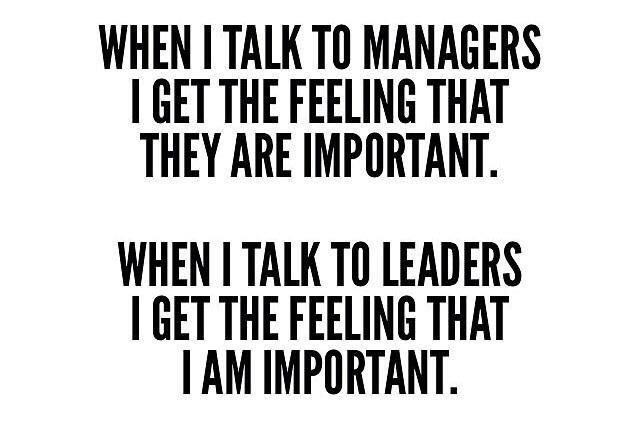
If anything, these quotes communicate an awareness and understanding of the difference between a manager and a leader. Based on his language, I think I know which one Bernie is, and it's the type of co-worker I'd be glad to tackle the startup grind with day-to-day.

I guess what I'm getting at is that the parallels between Bernie's values and healthy, effective startup culture (IMHO) are too real. The man is a team player with a long history of challenging authority and tackling social issues in grassroots movements. Place that in the startup world and I believe you have a recipe for challenging the status quo, team collaboration, and innovation. Unless you're afraid to rock the boat... then don't hire Bernie.


Creating Data Models in Swift With Core Data

Because of the lack of a built-in utility for creating data models for Core Data entities, a lot of tools have popped up to make developers' lives easier. Most notably among them, mogenerator. Mogenerator accomplishes a number of things. For sake of later comparison, I'll list a few of the most useful mogen features:

  1. Simple, easy creation of classes for your data model.
  2. Pattern of two-class creation -- allows you to have and keep custom code without risk of overwriting it, while still maintaining flexibility to update your entity's attributes in .xcdatamodel. Updates regenerate the second file, leaving the entity class file and added custom code in tact.
  3. Convenience methods to access the attributes of your entities.
  4. Scalar accessors that let you access BOOLs, integers, floats, instead of just NSNumbers.

I'm currently working on a project in Swift, which means another chance to reevaluate existing patterns and old habits that may or may not fit into the Swift paradigm. On a side note, hasn't the release of Swift been great on a meta level? I know of so many people and companies that have been able to use Apple's release of a new and powerful programming language as an opportune moment to fix or completely redo areas of their codebase that were dragging on the entire app (or company). Once you're caught in the technical debt trap, it's almost impossible to get out. But it is possible. And fortunately for us, Swift makes it easier and faster than ever before to write clean, maintainable, beautiful Cocoa apps.

I was recently at a SLC CocoaHeads meetup and asked the group if many people still use mogenerator in predominantly Swift projects. I was immediately directed to an Xcode feature that I've missed amongst all the other Apple news, a job change, and a relocation from SF to SLC over the past few months. Or maybe this came out with Swift 1.0? I'm not entirely sure. Either way, they told me Xcode can now generate classes for your models in a two-class pattern similar to mogen. Of the four mogen features mentioned above, the first two are now seamlessly integrated into Xcode + Swift.

To be fair, creation of NSManagedObject subclasses was always possible... and from Xcode 4.3 you've been able to do it from the Editor Menu too (pictured below). I actually wasn't aware of the Editor Menu trick... my experience with Core Data comes from working with it on two previous occasions. On one I was contracting with the team for six weeks. It used mogenerator and was my first exposure. My involvement with Core Data there was limited to referencing the data model and minor tweaks. The second project's Core Data implementation was completely manual. I took over the project and worked on it as the sole developer. Two very contrasting approaches, both suiting their needs just fine.

Back to the Swift + Core Data goodness, by selecting your .xcdatamodel file and opening the Editor Menu from the Menu Bar, you'll be given a contextual set of options relating to Core Data. Select Create NSManagedObject Subclass, select the data models and entities you'd like to manage (select all for the first time, select one or a few for an update), select the destination directory and create. This will create two files for you. The first is a subclass of NSManagedObject and represents your entity. The second creates an extension (similar to the Objective-C categories approach) called EntityName+CoreDataProperties.

//
//  User.swift
//  Perspectives
//
//  Created by Kyle Clegg on 11/19/15.
//  Copyright © 2015 Kyle Clegg. All rights reserved.
//

import Foundation
import CoreData


class User: NSManagedObject {

// Insert code here to add functionality to your managed object subclass

}
//
//  User+CoreDataProperties.swift
//  Perspectives
//
//  Created by Kyle Clegg on 11/19/15.
//  Copyright © 2015 Kyle Clegg. All rights reserved.
//
//  Choose "Create NSManagedObject Subclass…" from the Core Data editor menu
//  to delete and recreate this implementation file for your updated model.
//

import Foundation
import CoreData

extension User {

    @NSManaged var email: String?
    @NSManaged var password: String?
    @NSManaged var name: String?
    @NSManaged var userId: NSNumber?
    @NSManaged var collections: NSSet?

}

As the comments auto-generated by Apple note, EntityName+CoreDataProperties.swift will be scratched and regenerated when you run through the process again after you update your model in the future. That's the beauty of it. Any convenience methods, helpers, accessors, etc. that you may want to include should be added to the entity's class, and updates are handled by Xcode without destroying your code in the entity's class.

Gotchas? Nothing major really. I suppose two minor things are that CMD-clicking the entity when it appears in code in other places can bring you to an empty User.swift file when what you really wanted to see were the properties. A little annoying, but understandable. A second one is that when you regenerate models after a property update or addition Xcode doesn't overwrite the EntityName+CoreDataProperties.swift file. It creates a second one. Just select one of the two (either one), hit delete and select Remove Reference. ¯\_(ツ)_/¯

So there it is. Simple data model creation and updates using Swift extensions and native Xcode integrations. I should note that we are losing some functionality provided by mogenerator, but I'm okay with that for now. Mogenerator gave me way more functionality than I asked for, and I'll bring it back in the future if I feel like I need it. For now, I rest easy knowing that there's no magic going on, just simple, clean Swift Core Data code.

Hiking Half Dome

A few weeks ago I hiked Half Dome with my parents and sister. If you're unfamiliar with Half Dome, it's a huge granite dome that rises almost 5,000 feet over the main valley in Yosemite National Park. It's a challenging 16 mile round trip hike that requires being in a good shape and preparation, but isn't beyond the realm of possibility for regular people.

2015-09-08 07.01.00.jpg

We started at 5:30 AM from Upper Pines campground, which was about a 15 minute walk from the trailhead. Next time, I'd try to start at 3:30 or 4. It's not that the trails are too busy... it's just a long day ahead of you and you don't want to be pushing sunset at the end of the day. The cabled section near the summit is busy pretty much every day from 10 AM to 4 PM, so unless you start really early (3ish or earlier), there will probably some sort of wait and crowd near the top, but more on that later.

The good thing about starting before sunrise is that early morning hiking seems to pass by quickly. When you can't see past your headlamp's shine you focus on putting one foot in front of the other. We made good, quick progress before sunrise as a result.

Oh yeah, before I go any further... what are those things on my feet, you ask? And yes, lots of people asked. For the past five years I've worn Chacos for pretty much any outdoor activity I've done with the exception of running, including whitewater rafting, hiking, and canyoneering. The longest hike was probably 10 or 12 miles, so I was a little concerned about 16... but not too worried.

After my dad asked me about a hundred times about wearing open toe shoes the night before -- and even offered (insisted) I wear the extra pair of hiking shoes he brought -- I have to admit, I was wondering if I was pushing past the suggested Chacos threshold. With 1 bar of Edge service I googled "Hike Half Dome in Chacos" from the lodge, found nothing, and decided if I'd hiked Mt. Timpanogos with no issues I should be fine. I started the hike with a pair of socks on just to be on the safe side and took them off after two hours.

2015-09-08 07.54.06.jpg

About two-thirds the way up, after crossing paths with well over a hundred other hikers, and to my dad's surprise, we encountered a second Chacos-wearer. In her mid-fifties and sporting a full-length hiking skirt, she caught up to us as we were paused for a rest. She commented that she'd been following my tracks for a while, searching for her Chacos mate. While I can't say I recognize Chacos footprints myself, I'm very impressed. Respect, Chacos lady, respect.

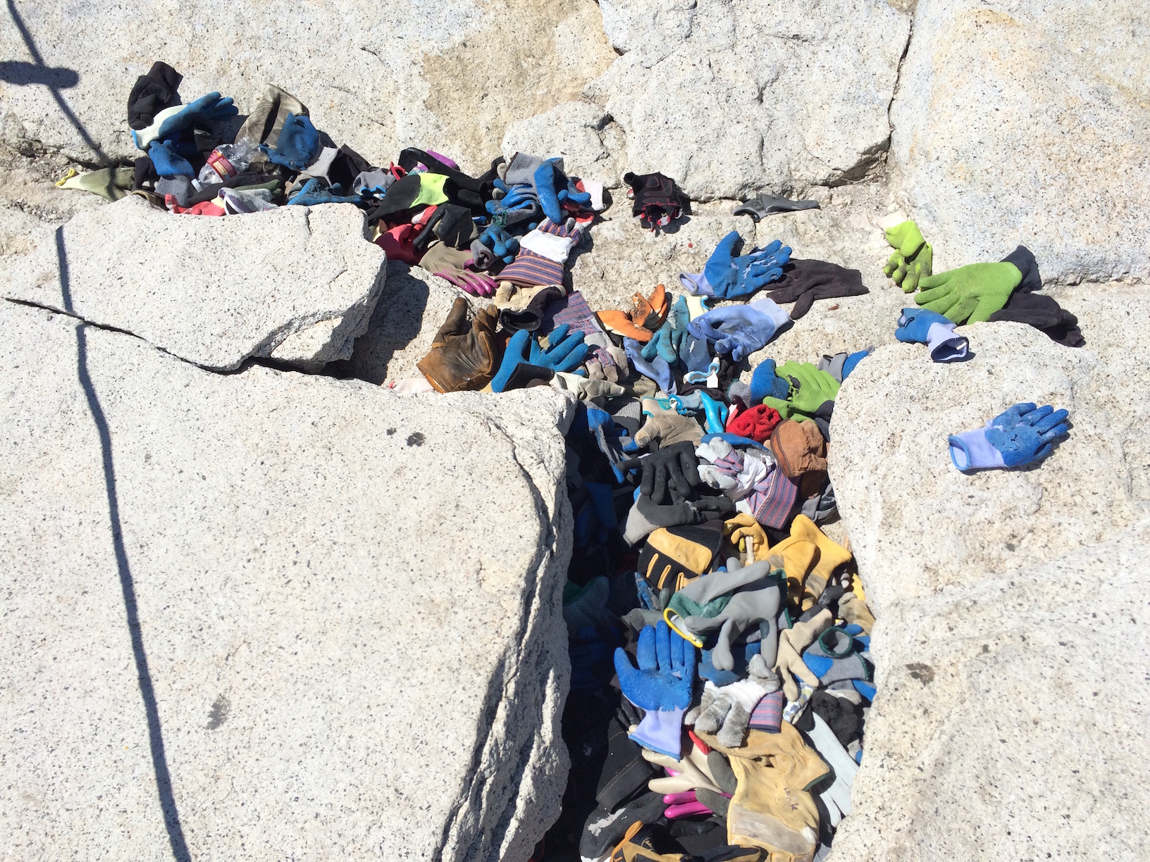
The final ascent to Half Dome's summit includes a 400 foot stretch of metal cables, at as much as a 45 degree angle. The cables were initially put in place almost a hundred years ago and they allow anyone with a good pair of gloves to ascend relatively safely. Injuries and death have occurred, but they are uncommon. The cables make for a interesting, almost welcoming challenge after propelling yourself 8 miles straight uphill with your legs.

As we were hiking down a wildfire broke out to the northwest of the summit. A few helicopters and half a dozen planes showed up, surveyed the scene, and dropped powdery red fire-retardant.

There are two main trails you can take to Half Dome. The John Muir trail is a bit longer, but less strenuous, while the Myst trail is shorter but much steeper (and full of hundreds of huge steps). We took the John Muir Trail up and the Mist Trail down. We hustled down the mountain and got back to camp right at dusk.

Feet-wise, the Chacos did the job, and some. They had excellent grip on sub dome's and Half Dome's granite surfaces, and got me home 100% blister free. If you're questioning whether your Chacos can handle Half Dome, the answer is yes... so long as your feet are used to the straps and you've done a few shorter hikes with them before. As far as who fared better on the mountain between my old man and me, I'll put it this way. One of us never had to stop to change socks. One of us made it up and down without blisters. It's the same one.

Embracing Diversity

Alternate title: Why we're failing at diversity and what we can do to fix it.

Diversity is one of those things all businesses want. Like creativity or innovation, it sounds great, feels hip, and helps your business look good, right? But do we really value diversity, or just the word itself? When talking about diversity the first obstacle to tackle is understanding why it matters so much. Otherwise it may be misunderstood and relegated to another checklist item like ping pong tables , free meals , and bring your dog to work Fridays .

WHY IT MATTERS

So why is it important? Because diversity directly translates to success. A recent study by First Round Capital found that companies with a female founder performed 63% better than all-male teams.

Diversity is an opporTunity

Think about that. That's a 63% higher ROI for investors. That's real return, real profits, real success. It benefits business owners, investors, employees, and customers alike. Diversity works. It breeds success and is NOT a checklist item. It's an opportunity, and with increasingly competitive industries on all fonts, it's a big one.

We should think about diversity similar to how to we think of innovation. There’s no magic moment when a company or team becomes innovative. Rather, ongoing innovation drives the success of the product, culture of the team, and evolution of the company. Tell me the last time you thought, “Whew! As of our last hire we are now innovative.” Ridiculous, of course. Diversity, like innovation, is something we actively work to improve. And remember, the reason why... diversity drives success.

So What is diversity

Before I go any further I should clarify, what is diversity? It's not just about skin color or gender, that's for sure. Which is part of the reason why throwing up a "diverse" team picture on your company website (worse yet, paying actors to model for it) or holding an obligatory women-in-tech panel at a conference doesn't all of a sudden mean you're diverse. The power is in creating an environment with diversity of perspective, experience, and thought. In slightly different words, as Entrepreneur put it recently, conflict is part of human nature.

Why can’t we all get along? Because we can’t. Conflict is part of human nature. There are times when it’s important that we don’t get along. There are times when we need to confront our differing viewpoints and learn to conflict in productive ways. The great irony is that the process of learning how not to get along is critical to building successful relationships and effective teams.
— http://www.entrepreneur.com/article/248684

Diversity doesn't necessarily mean we don't get along, but it does mean valuing perspectives and giving differing ideas ample chance to be explored. Conflict, so long as you steer clear of cheap shots and toss egos out the door, can be a powerful thing. Learning to confront our differing viewpoints and conflict in productive ways can drive the development of new ideas, strategies, product designs, and more.

I support diversity, I swear

Is diversity actually a problem today? Yes. This post isn't meant to be an attack on anyone. But at the same time, I'd guess that 99% of the people who hear the word would think, "chyeah, go diversity, for sure!"

And yet, things like above still happen. All. The. Time. A few weeks ago at a tech conference a talented female founder and CEO told me that the lead investor in her company asked to meet without her present at the next board meeting. She obliged because with no other interested investors, she didn't have any other options.

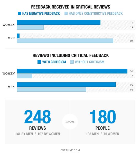
Let me give another example with a wider data set. Recently, a study was performed where employee reviews were collected from men and women in tech. 245 reviews were collected, from 180 people, 105 men and 75 women. The reviews were shared voluntarily with no special stipulations about gender or any other factor. The question to be answered was "Did review tone and content differ based on gender?" The results:

Critical feedback was not evenly distributed by gender. 59% of the reviews received by men contained critical feedback. 88% of the reviews received by women contained critical feedback. In other words, "Men are given constructive suggestions. Women are given constructive suggestions – and told to pipe down."

While both men and women received constructive criticism, women were also more likely to receive negative personality criticism... much, much, more likely in fact. "This kind of negative personality criticism—watch your tone! step back! stop being so judgmental!—shows up twice in the 83 critical reviews received by men. It shows up in 71 of the 94 critical reviews received by women." The manager's gender did not affect the nature of critical feedback in the review.

There’s a common perception that women in technology endure personality feedback that their male peers just don’t receive. Words like bossy, abrasive, strident, and aggressive are used to describe women’s behaviors when they lead; words like emotional and irrational describe their behaviors when they object. All of these words show up at least twice in the women’s review text I reviewed, some much more often. Abrasive alone is used 17 times to describe 13 different women. Among these words, only aggressive shows up in men’s reviews at all. It shows up three times, twice with an exhortation to be more of it.
— http://fortune.com/2014/08/26/performance-review-gender-bias/

I would challenge ourselves to think honestly about our past experiences. Were we more quick to perceive a woman's opinion or action as "abrasive" than a man's? According to this study, the answer is likely yes. In addition to promoting equality, welcoming differing opinions can lead to healthy debate and challenging the status quo in ways that may not have occurred otherwise.

Without a culture of diversity -- as well as a framework that allows teams to openly challenge the status quo and debate ideas free from intolerance and dogmatism -- we run the risk of 1) failing to give good ideas a chance to be explored, 2) bad decisions being made for the wrong reasons, 3) team members feeling their views are suppressed, and 4) losing valuable team members entirely.

What can we do?

Well, that may have been a lot to process. Fortunately, we're coming to a set of solutions. Suggested by @br_ttany at #TechFestNW last month, there are two simple action items that will translate into immediate results in terms of walking the diversity talk.

  1. Identify inconsistencies
  2. Amplify voices

Identify inconsistencies

When we overhear racist, sexist, or otherwise prejudiced remarks or spot other inconsistencies in our goal to be open, inclusive, and diverse let's talk about it. This means looking at promotional materials and job perks, considering our lunchroom conversations, office environments, and business trips, and prioritizing what's important. Do you value diversity? Are you communicating it?

I recently attended #StartFEST in Provo, Utah. I was blown away by the support from local communities and the success of growing businesses. It's really something, what's going on in the Salt Lake area. One thing I found disappointing, however, was the lack of diversity in the tech community. In one presentation, a local VC firm celebrated their prized founders list (pictured in slide).

See any issues? 100% male. 90+% caucasian. Conveying to all in attendance that THIS is what success looks like. We need to fix this. Why is it an issue? Because the way we portray success translates into the way we hire, manage, and run our companies.

I would be so proud to be a part of a diverse tech community, where seeing women and people of color in these types of presentations is commonplace. I hope we'll get there soon.

Amplify voices

The second key action we can take is to amplify differing voices and opinions around us. That means taking the time to listen to people who are not like you. Yes, fixing diversity in tech is a big, challenging issue, but throwing our hands up is not an option. Take a look at your Twitter and Instagram feeds. Find people who are different from you and follow them.

Amplifying voices different than your own shows you respect and support people of varying backgrounds, experiences, and perspectives. And frankly, we need more of that in the world. If it helps lead to successful businesses and growing economies, which it does, then I'm an ally.

Moving Onward and Upward

It's come time for Dru and I to part ways with First Opinion. It didn't turn out to be the right long-term fit, but I am proud of what we were able to accomplish in the last six months. Implementing drastic changes as a brand new employee has been one of the most difficult things I've been faced with in my career. There's a few things I'd like to do for my own reflection.

Successes

I didn't accomplish as much as I would have liked, and I have much to work on to improve my ability to promote change. However, I'd like to make a list of the things I accomplished with the help of the team and the hard work of a great product manager (who probably shouldered more of the work than anyone). I guess I'll call this the high-level "timeline of success".

  • Eliminated dozens of bugs in the iOS codebase
  • Launched a new results feature, giving patients summarized outcomes of their doctor consults
  • Added robust analytics tracking to monitor use and performance of app features
  • Laid the groundwork to integrate video-based telemedicine services into core product lineup
  • Worked towards a HIPAA compliant software stack
  • Guided a transition in mobile app design from a pixel-perfect to constraint-based approach, relying heavily on the Human Interface Guidelines
  • Identified weaknesses in the engineering process and worked together towards valuable improvements
  • Established periodic product team meetings to discuss vision, roadmap, and designs
  • Established periodic retrospectives as an open forum for team discussion and reflection

I didn't accomplish any of the above below items myself, and of course there is much more work to be done. However, we made some very significant strides in these areas that I feel, and hope, will be beneficial to the company long after my name is no longer found in file header comments, Confluence pages, and commit logs.

Learnings

I also want to reflect back on what I've learned. I've had many moments of clarity over the last year where I realized things could or should've been different than what actually happened. Tempting as it is to write a longform post-mortem detailing all the reasons why First Opinion didn't work out, I'll skip it. My goal is to get back to one of the things I enjoyed as a student, writing a series of blog posts about key learnings and takeaways, but now with the experience of working with startups in Utah and San Francisco.


Early Watch Thoughts

I ordered an Watch the day preorders began at about 5 PM. (P.S. The shortcut for the  character is option-shift-k on a Mac. Memorize it.. it will come in handy.) Between my indecisiveness about which case and band combination to get and other things going on I missed the midnight-sharp preorder. So, I had to wait about a month longer than a lot of my developer friends to receive my Watch.

It finally arrived on June 1. Unfortunately for me, I didn't make it back to my apartment before the front desk attendant that received it locked up for the night, so I had to wait another 12 hours before getting it the next morning.

Current status: Watch in hand. Lola is thrilled.

A photo posted by Kyle Clegg (@kyleclegg) on

So... just... why?

I've been asked several times before and after I got the Watch why I wanted one. There's a couple reasons:

  1. I'm an iOS developer. My entire industry was created almost overnight when Apple released the iPhone and subsequently the App Store seven years ago. Watch is a new platform, and although people are justifiably skeptical, I want to be familiar with the device itself, its apps, and the tools for building watch apps given that it could have profound effects on my future career.
  2. For almost two years now, Wired, FastCompany, Mashable and the like have been proclaiming wearable tech will become an industry as big as the smartphone. We've seen some interesting products like Google Glass, Pebble Watch, Fitbits, Jawbone Up, Garmin GPS Watches, and tons more, but nothing has really pushed us into the phase of ubiquitous wearable technology. Will Watch do it? I don't know, but I'm anticipating it'll bring us closer than we've been in the past.
  3. I'll admit it. I've become quite enveloped in the Apple ecosystem since moving into iOS development three years ago. I use a MacBook Pro on a daily basis, an iPhone, and an iPad. I used to use an iPod before my iPhone replaced that need for me. I enjoy the quality of Apple products (as I also enjoy the quality of my Xbox One and old Nexus 4) and their relentless attention to user experience. I hoped that the trend would continue with Watch.

The Unboxing

This isn't me, but for reference... 

The packaging was nice, as it always is for these types of products, and the pairing process was beautiful. Your phone becomes a scanner while a nice animation displays on your Watch. You point your phone's camera at it and you're paired.

First Impressions

Love it - Setup

There's no need to search for and download 50 apps to get up and running. Because you already have an iPhone full of useful apps and because many of those app developers wanted to provide you with an Watch experience, all you have to do it select which apps you already use and love on your phone that you now want on your watch. On top of that, you don't have to login or configure anything for those apps, since they're already authenticated from your phone.

Love it - Notifications

I've long felt that something is wrong with iOS notifications. From 2009 to 2012 I would switch back and forth between Android and iOS each year and always felt that Google had figured it out with their notification management. On Android it was easy to receive notifications, even in other apps or games, and decide whether to engage or ignore. The notification would also clear when you opened the app later, preventing you from a mess of old notifications hanging around your notification drawer. 

Apple has improved notifications greatly since 2011 with the notification center, actionable notifications (reply to text message, etc.), and the ability to clear multiple notifications simultaneously, but I still find my notification center clogged with alerts that haven't been relevant to me for days. Already, the Watch has solved part of this problem by giving me easier access to my notifications.

Love it - The inconspicuousness

I didn't want to become a glasshole. Well, I didn't. Err ...at least don't think I have. I live in San Francisco and need to keep my head up when I walk to work so I don't get hit by an Uber driver. To that point I really like being able to get a notification to my wrist. It saves me from needing to pull out my phone probably 50-70% of time. Random ESPN notification? Nah. Urgent work thing? I'll pull my phone out and look into it.

Love it - Battery life

There's not much to say... it's really good. Definitely gets you through the day. I think Apple played it smart by limiting third-party developers from accessing some of the higher energy-consuming features of the watch for the initial launch. This fall, third-party apps will be allowed access to the speaker, microphone, heartbeat monitor, and other sensors. Battery life will definitely be affected, but I trust Apple wouldn't open up the developer toolkit unless they had a good way of ensuring the majority of apps won't turn into battery guzzling drains.

Love it but needs improvement - Apple Pay

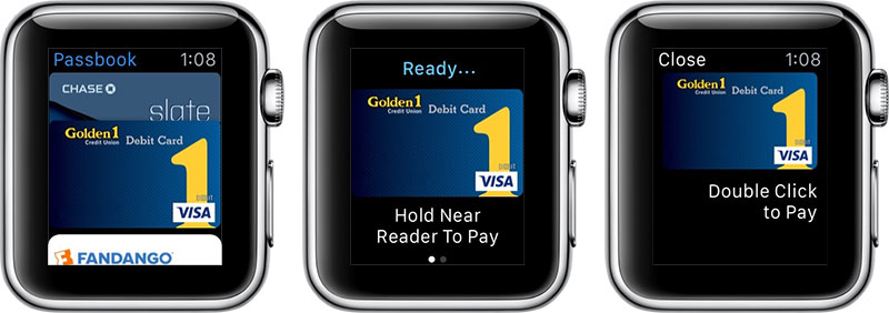
Apple Pay is nice. Dru and I both use it on our phones when at Walgreen's or Whole Foods. On Watch it's even more convenient, so thumbs up there. The first time you use it, though... it's awkward.

On that third graphic how would you think you activate Apple Pay? The part where it says "Double Click to Pay?" I'll give you a hint, it doesn't involve any TAPPING. You double CLICK the side button. I guess you learn it once and you know, but when you have a line of 5 impatient San Franciscans behind you at Whole Foods and can't figure it out for the life of you... it sucks. Hypothetically speaking, of course. So while I love the convenience of Apple Pay from a watch, the education behind it still needs improvement.

It's okay - Default activity tracker

It's pretty cool, I think. I haven't been meticulous in setting target numbers, but in general it's helped me pay more attention to my health throughout the day. And I haven't turned it off yet, so that's a good sign.

It's okay - App loading times

Some apps (including Apple apps) take a little while to load. This should also be improved this fall when apps are allowed to run natively, rather than relying on your phone's Wi-Fi and the watch's bluetooth connection to your phone. It'll also improve as app developers get more familiar with the platform and optimize their apps for Watch (e.g. by not loading tons of data up front like they may be able to get away with on iOS or Android).

Needs improvement - Becoming a staple

The device isn't on the level of making me turn around and go grab it if I realized I've forgotten it five minutes after leaving my place. Maybe it'll get there. I also sometimes forget to charge it at night, which means I either leave it home for the day or bring the charger with me and plug it in somewhere.

Watch Apps

Some of the apps I use:

  • Faces - The default screen that shows when you look at your watch. I chose the solar face because I think it's pretty awesome. 
  • Instagram - the square nature of Instagram makes Watch a great platform for it. It's surprisingly easy to browse Instagram from the watch. I think my IG activity might've doubled since it's one of the first highly functional non-Apple Watch apps I've found.
  • Twitter - not crazy functional, but useful.
  • Timer - it's just easier than an iPhone timer for some reason. Small thing, but nice.
  • Slack - you can't scroll full channels of chat messages, but you can see DMs and mentions.
  • Passbook - Dru and I have seen two movies by just pulling up a Fandango pass on Watch. The theater attendant scanned the QR code on the watch and we were in. Really smooth both times.

I'm sure I just haven't been exposed to dozens more great apps. If you have any that come recommended, please let me know.

Watch or Watch Sport

I couldn't decide which one, and you might be in the same position. I ended up ordering the sport edition (black aluminum case) the first day so I could get my order in, but then changed my mind and ordered the stainless steel with black leather loop. I didn't cancel the first order, and both have now arrived so I've actually been able to play with both models. I decided to keep the Watch Sport because I liked how I really liked the inconspicuousness and how lightweight it is - it just felt normal and right. It was also cheaper. The stainless steel definitely felt more professional though, and that milanese loop 👌. Both are fantastic.

Conclusion

I don't really have a formal conclusion. So far I'm happy with my purchase and am looking forward to more apps coming to Watch, as well as more functionality in existing watch apps as Apple opens up the platform a bit more this fall. I can't say you should go drop $350+ on an Apple Watch today, but if you are already a watch person, or a tech early adopter, or perhaps both... then go for it. And send me a little digital touch drawing if you do.

(Re)naming your app

One of the biggest goals of every iPhone or iPad app is to show up in App Store search results for anything relating to the title or general purpose of the app. Apple gives you 255 characters to title your app. 255 is kind of a lot. One practice to get better placement is to include subtitles, phrases, or keywords in the app title itself, which (it's generally believed) factors into the in the app's ranking in search results. This explains why several apps have titles such as below.

  • Day One (Journal / Notes / Diary)
  • Amazon App: shop, browse, scan, compare, and read reviews
  • TuneIn Radio - Stream free music, sports, talk & news stations, podcasts, songs & tracks
  • Later - Automatically Text, Tweet and Email Scheduling For A More Productive Life by Postpone and Delay
  • First Opinion - Free 24/7 Doctor Access

Apple also gives you 100 characters to provide "one or more keywords that describe your app. Keywords make App Store search results more accurate."

Now obviously this is important. So what's the point of this little write up? Well, we recently changed the name of First Opinion from "First Opinion - Text a Doctor" to "First Opinion - Free 24/7 Doctor Access."

In doing so I noticed something interesting. When I search for "First Opini..." on the app store I now see both titles as well as the company name in the search results. I'll be honest, I have no idea how long the old title will continue to show, but it made me think... while it's important to have your app correctly titled and to optimize keywords for better search rankings, you may want to be careful how often you do it.

If you find yourself obsessing over keywords, titles, and App Store Optimization as a whole, just... stop worrying about it so much... before you start communicating your finickiness to potential users. Choose a solid title for your app, some relevant keywords, and move on to focusing on building an all around great app. ASO is important, but not nearly as important as shipping great product.

Here we are, San Francisco

Well... it's been a while. And a lot has happened the past two months. First off, Dru and I have now officially moved from Utah to California. Right around New Year's an opportunity arose for both Dru and me at a company called First Opinion. After much thought, we decided to postpone our plans to build in Lehi and join the team in San Francisco. Super hard decision given how much I've been rooting for the little guy in Utah tech the past five years. I really love the Utah tech community and our CocoaHeads meetups. Thinking about it though, while Dru and I recognize that there really isn't a better place to bootstrap a business, this was an opportunity we didn't want to let pass by.

We accepted positions with First Opinion a few weeks ago, and in about two weeks went from finalizing floor plans/prepping to build a 2800 sq. foot home to selling virtually everything on KSL and moving to San Francisco in search of a small 1 bedroom apartment with 12 boxes and a couple suitcases to our name. Never would've guessed this, but finding housing in San Francisco is hard. Who knew? Between hotels, Airbnb, and crashing at the office we've had a comfortable bed to sleep in, but hopefully we'll be able to wrap up the apartment search soon. I know Lola would be rather appreciative.

The great thing about moving is the chance to start fresh. The past month has included 6 full Jeeps worth of donation items to DI, the sale of 3 vehicles, and about 20 items sold on KSL. It's funny how attached you can get to your possessions. And not just because they are shiny and new -- I'm talking old Jeeps, game consoles, a dumb t-shirt you love, and a $20 set of golf clubs. Some of the best parts were seeing the new homes that our stuff was going to. Granted, we let a lot of our stuff go at a premium since we were trying to get out to San Francisco as fast as possible... but from the guy who bought Dru's red Jeep with plans to turn it into a southern Utah rock crawler in 30 days to the teenage girl who was so stoked to get an Xbox 360/Kinect and a bunch of games. Or the people that found the first starter snowboard, road bike, and golf clubs. Or the teenager and dad that bought my XS 400. All awesome homes for some of the toys that have made life more exciting in one way or another over the past few years.

Last Tuesday, after 3 days of packing with some HUGE help from family and friends we finally got on our way. And now, in pictures...

Passed out after staying up all night packing.

Passed out after staying up all night packing.

You've been good to us, yellow brick Lehi home. So long for now.

You've been good to us, yellow brick Lehi home. So long for now.

We packed up a 10' Budget rental truck... definitely did not need the whole thing. Or 80% of it.

We packed up a 10' Budget rental truck... definitely did not need the whole thing. Or 80% of it.

Lola enjoying her first few days in the city, constantly at Dru's hip.

Lola enjoying her first few days in the city, constantly at Dru's hip.

Holding up at a hotel near the office.

Holding up at a hotel near the office.

Lola attempting to get used to the whole city thing.

Lola attempting to get used to the whole city thing.

At a cafe in Hayes Valley.

At a cafe in Hayes Valley.

We've been doing a lot of apartment searching the past couple weeks. The dynamics of all the different neighborhoods is so interesting. You have some of the more traditional San Franciscan neighborhoods like the Castro, Nob Hill, and Hayes Valley, you have the Civic Center area with Twitter and a few high-rise residential buildings like NEMA and AVA popping up, and you have these newer districts like Mission Bay and Dogpatch that are a little further out (but not too far away). I'm glad we didn't just jump into a lease found on craigslist before checking out the areas, because in addition to working in the city, we're excited to live in and be a part of the community. We want to find an area that gives us easy access to do that. A couple leading favorites as we've been searching are Avalon Hayes Valley, 8 Octavia, and Linea, all of which are in the Upper Market to Hayes Valley neighborhoods.

To wrap it up, Dru, Lola, and I are here, safe and sound. We're getting up to speed at First Opinion and looking forward to contributing to its massive success ;). We worked together at Solutionreach for two years and really loved contributing towards a meaningful product, and being able to do that together. Being an earlier stage company and being direct to consumer rather than selling to doctor's offices, it's a unique opportunity to make a difference on a small, but passionate and dedicated team in an industry that we care about.

Swift Flickr Search

The Flickr API has been a go-to resource for iOS programming tutorials pretty much from the beginning. Well, here it is in Swift. A couple months ago I was asked to do a coding challenge for a job interview. The instructions didn't specify a programming language, only to write an iOS app that searches the Flickr API for images and displays them (those weren't the exact instructions, but more or less cover it). I did it in Swift, and although it took me longer than it should've, I learned a few things about programming in Swift.

Super basic layout... just a search box and a table for search results

Super basic layout... just a search box and a table for search results

Tapping a search result shows a larger version of the photo

Tapping a search result shows a larger version of the photo

Swift lessons learned:

  • Data provider pattern
  • Asynchronous callbacks
  • Using structs to declare static variables
  • Simple JSON parsing

Data Providers

Rather than putting the networking code in the view controller, it is separated into a data provider class. This class uses a callback to send the appropriate data back to the view controller for display. This pattern is used in Objective-C as well, and is a great way to keep code organized and avoid massive view controllers.

Asynchronous Callbacks

Due to the asynchronous nature of API calls, it's useful to return a callback from the data provider once the server response has been returned. This is done by defining a callback block in the FlickrProvider class.

typealias FlickrResponse = (NSArray?, NSError?) -> Void

The callback will be passed into the function to fetch photos.

class func fetchPhotosForSearchText(searchText: String, onCompletion: FlickrResponse) -> Void {
  // Hit API, parse JSON response, return an array of photos
  onCompletion(photosArray, nil)
}

Use in your view controller as follows.

FlickrProvider.fetchPhotosForSearchText(searchText, onCompletion: { (photos: NSArray?, error: NSError?) -> Void in
  if error == nil {
    // Fetched some photos!
  }
})

Static Variables

Run into class variables not supported yet? Use a struct instead. Where you would have used a const or a #define before, you can declare struct with a static constant. This can also help you keep API credentials, notification names, NSUserDefaults keys, etc. organized.

struct Keys {
  static let flickrKey = "z0461br2b85aee5"
}

jSON Parsing

There are a few libraries that have been written to help you parse JSON in Swift, but in this case we'll just keep it simple and us NSJSONSerialization. This will convert JSON into a dictionary.

var jsonError: NSError?
var resultsDictionary = NSJSONSerialization.JSONObjectWithData(jsonData, options: NSJSONReadingOptions.MutableContainers, error: &jsonError) as? NSDictionary
if jsonError != nil {
  println("Error parsing JSON: \(jsonError!)")
}
println("results: \(resultsDictionary)")

finished Product

The end result is a simple app that allows you to search the Flickr API to your heart's content. View SwiftFlickrSearch on GitHub. The code doesn't have many comments because by nature Swift is fairly self-documenting. Welcoming any changes or improvements though.

TestFlight and the iOS Testing Workflow

Apple may be trying to teach us something about testing with the new TestFlight integration that quietly rolled out in September. For the greater part of iOS's life, testing has been a problem that was up to the developer to solve. Only recently, with Apple's acquisition of TestFlight and Twitter's acquisition of Crashlytics, has an more concrete workflow emerged.

Internal and external testers

You can now add up to 25 internal testers to your application. These testers can immediately receive a build once it's been uploaded to iTunes Connect. 25 is nothing though, you say. We could add 100 devices to the iOS Dev Center, you say. Enter external (beta) testers. You can now add up to ONE THOUSAND external testers. That's 1000 people to help you refine your app before you launch, or critique your design update before you tick off your existing user base.

There's a catch, though. All builds distributed to external testers must pass through an Apple review. While these reviews do not fall into the same queue as those submitted for App Store release, they can take time. For Scrimp, the first review took about 12 hours, with two reviews since then taking just a few minutes, each. What this means, though, is that you can't power through a three new features on Friday afternoon and expect to send it out to beta testers before peacing out for the weekend. And maybe that's a good thing.

Note: internal testers require iTunes Connect accounts, external testers just require an email and downloading the new TestFlight app.

The new Prelease dashboard tab in iTunes Connect

The new Prelease dashboard tab in iTunes Connect

What Are You Suggesting, Apple?

The new workflow seems to suggest a pattern of sending frequent (daily?) development builds to an internal team -- perhaps developers, designers, QA engineers, product managers, etc. -- and more polished testing builds (i.e. those passing Apple's prerelease review) to the external team -- company executives, beta testers, grandma, etc. It also could mean the elimination of the putting the latest (aka buggiest) builds directly onto others' phones at random points throughout the day. Rather, quickly submit from Xcode and hit a button in iTunes Connect to distribute. Let Xcode and iTunes Connect manage the distribution and versioning for you.

It's clear that Apple has heard our concerns and is opening the doors WIDE OPEN in terms of beta testing apps. No more setting up people in the iOS member center for the sole purpose of installing a test version of the app. No more worrying about managing and deleting devices (actually, you still need to worry about it, but chances are tons of your 100 allotted devices are being used exclusively for test devices). No more need for an enterprise account in a lot of cases too. Everything is simplified. What you now get is the ability to easily test your app with as many people as most could want. We went from 100 testers PER DEV ACCOUNT to 1000 testers PER APP. Now that is awesome.

Now WHAT

That's up to you. If you've already got a system working with Crashlytics, HockeyApp, or even the old TestFlight web app you may not need to worry about it. On your next project though, I'd recommend trying the new Testflight integration. Apple puts extreme amounts of energy into product design, as we all know, and this is no exception. If nothing else, I find it interesting that Apple has structured the workflow this way. It's similar to environments I've been a part of and setup in the past, but now has the potential to establish itself as a community best practice.

Flight

Returned from @Flight late Wednesday night. It was Twitter's first mobile developers conference and I was lucky enough to get accepted to attend. No real expectations going in, other than to see what a Twitter hosted conference would be all about and meet some cool people.

In contrast to my experience at WWDC 2013, Flight was much smaller. 800 attendees, plus press, vs 6,000 or so at WWDC. It was held at the Bill Graham Civic Center, near Twitter HQ and right in front of SF City Hall. Apparently also the site of punk rock shows I probably would've attended had I grown up near San Francisco.

#womenInFLIGHT

Flight actually kicked off with #womeninflight, a panel of inspiring women discussing their challenges, triumphs, and experiences working in tech. My favorite comment of the night was probably Patty McCord's response to a question of women's wages, how to ask for a raise, and "trusting karma". She said, simply, "If you want to get paid well, work with smart people on shit that matters, and deliver on time."

A few of my favorite takeaways.

Not the most surprising comment coming from a recruiter, but a great point about knowing the data and your market value nonetheless.

On the topic of companies underpaying women engineers sometimes the only solution is to leave.

I believe the correct stat was 41% (not 61%), awfully high in either case.

This is something I believe the entire industry can fix. Engineers, product people, business-y people. We can all relate to being the only whatever in the room in some way. It's not a fun feeling. Kindness and openness to the backgrounds of others goes a long way towards the productivity of a team and the success of a company.

#TWITTERFLIGHT

Since I joined Twitter in 2011 -- yes, I am a late adopter, Twitter reminds me every time I looked at my profile --  no other app has changed the way I consume information about the world more. Twitter has had a profound effect on my ability to quickly access information I want, in real-time, and with direct access to people or channels I care about. With that in mind, I was excited to see what their mobile developers conference would be all about. The biggest news at Flight the launch of Fabric, a suped-up, easy to use wrapper around Crashlytics, MoPub, and a Twitter SDK. The biggest surprise was definitely Digits, a service that allows your to log into apps by ditching the traditional username/password combo and just using your phone number.

Pre-keynote. Twitter had people use Jawbone Drop to select the music playlist. They also grabbed tweets and put them up for all to see. We wondered if it was pulling all tweets with the #twitterflight hashtag, but ultimately decided they were curati…

Pre-keynote. Twitter had people use Jawbone Drop to select the music playlist. They also grabbed tweets and put them up for all to see. We wondered if it was pulling all tweets with the #twitterflight hashtag, but ultimately decided they were curating the list.

Dick Costolo kicked off the conference with a short intro. I think I was expecting more from him, but it was fine.

Dick Costolo kicked off the conference with a short intro. I think I was expecting more from him, but it was fine.

At the end of the keynote and Digits demo I got pretty excited about things. Even made it up onto the big screen (top right).

At the end of the keynote and Digits demo I got pretty excited about things. Even made it up onto the big screen (top right).

Without boring everyone with a play-by-play that you could get on any tech blog the last fews days, here were the most interesting parts to me:

  1. The idea of phone sign-in taking over email/password and even social sign-in. A great point that someone made was wait... isn't SMS dying? I'd say yes and no. Declining, absolutely, but I don't think it's going away. The part that does seem a little self-serving to me is the point that people in Brazil and India with no email can now use Digits to sign up for apps. The thing is, they probably won't be using an iPhone in that case, because Apple requires an email address in order to setup an Apple ID and download apps on the app store. So while it may help people without an email address more easily use apps on the web, I don't see how it specifically helps iOS and Android developers on that front.
  2. I will start using Digits in my apps ASAP. Yesterday I implemented it in an app I'm working on at i.TV. It was easy to implement, but it doesn't work very well yet. We tried signing in with 4 or 5 mobile numbers across both AT&T and Verizon and none worked. The only one that worked for me was using my Google Voice number. Fabric is brand new, and not yet open to the public, so I'm not too worried. By all accounts it looks like it'll be a big time-saver for both developers and end users.
  3. There was no mention of Windows Phone. Not once. I'm a big fan of WP and hope it establishes itself as the third player in mobile, and honestly I thought it had. But from the presentations, verbiage used e.g. "both" platforms, and talking with other attendees it was pretty clear to me that as far as anyone is concerned, only iOS and Android exist.
  4. Roughly 12% of engineering grads are women. Combine that with a 41% rate of women leaving engineering careers and that makes for a very small percentage of women at current tech companies. I'm a little biased, because my wife is an Interior Design/Architecture student turned product analyst, turned front-end developer, and most recently turned product manager. The perspective and feedback she brings to my former school projects, hackathon ideas, startup ventures, and current career path is truly invaluable to me. The diversity of her feedback is such a great thing, for me, and I know diversity of thinking can be a huge benefit to all teams and companies.
Inside the M&A Process - small panel discussing learnings from the acquisition of Crashlytics.

Inside the M&A Process - small panel discussing learnings from the acquisition of Crashlytics.

Hands down the most delicious sugar cookie of all time.

Hands down the most delicious sugar cookie of all time.

2014-10-22 15.35.34.jpg


Why transparency can hurt you

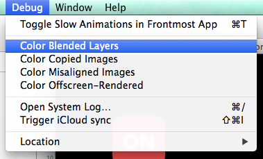
It's true. Transparency can cause your app major problems. You know what's the worst? Apps that freeze up, especially when scrolling. If you want a great user experience then you want great graphics performance. Enter transparency. There are some simple ways to optimize your layouts in order to improve graphics performance. Because what you don't want is a huge hierarchy of nested views with transparent backgrounds, layered on top over each other over and over again, all in a massive UICollectionView with tons of networking requests going on.

Individually, none of those things are bad. Transparency? Noice. Fresh data? Good. Beautiful UI? Yeah.

However, with iOS 7, iOS 8, and Yosemite's dive into the use of blurs and transparency in the quest for Clarity, Deference, and Depth come decisions and tradeoffs to be made in the implementation of our apps. 

The first thing is to understand a little about compositing. When it comes to motion pictures compositing involves combining visual elements from separate sources into a final image (or sequence of images). Think green screens.

In a mathematical sense one of the basic operations of compositing is referred to as alpha blending. Consider two images placed on top of each other, the foreground image with an alpha level of 0.5. Compositing occurs by mathematically combining information about both images and generating a third, composited image.

In iOS it's very common to set a view's alpha property in order to gain a level of transparency. In combination with the use of blurs Apple has created stunning interfaces in the operating system itself and in Apple apps like FaceTime and Camera. And lots of great apps have followed suit. Tons. But here's the problem, it's not as simple as going in and setting some clear backgrounds. To create a great user interface and a smooth, fluid experience the use of blurs and transparency must be extremely calculated. It's easy to add some transparency, try it out on the simulator or your newish iPhone, and call it good. But will it hold up across all devices, OS versions, and when used in a UITableView containing dozens, or hundreds, of items?

Fortunately there are a few simple things that can be done to optimize graphics performance. These are the low hanging fruit, but can potentially make a huge difference.

  1. First, be conscious of using [UIColor clearColor]. It's not free!
  2. Declare views as opaque whenever and wherever possible. Have a UILabel with a clear background and colored text? If whatever's behind the label is a solid color, then rather than setting the background of the label to clear, set it to the appropriate color and set opaque to YES. This will prevent the need to blend the layers every time the view is rendered.
  3. This is a silly one, but if you have a button without text, make sure you remove all text and set the font color to default. There is no reason to set the text to clear color. None at all.
  4. Be aware of animating alpha changes, for example when asynchronously fetching images while scrolling a UITableView. The fade-in might look nice, but it can be costly. Consider a good placeholder image instead. If you take a look around (e.g. Facebook, Twitter, among others) you might notice that the fade-in is a little less common than you thought. I'm a big fan of Twitter's unobtrusive gray placeholder that switches to the image as soon as it's been downloaded and readied for display.

Okay, so transparency is not inherently evil, but it can lead your app to dark dark places. I've recently been taking a hard look at graphics performances in apps I'm working on and have been pleasantly surprised at the performance gains (errr, absence of performance issues) using said techniques.

Other suggestions:

  • Use Instruments to measure your app's graphical performance
  • Turn on "Color Blended Layers" in the iOS Simulator - you might be surprised at the places where the GPU is wasting precious computational cycles


Also recommended:


New in UIKit in iOS 8

With all the excitement surrounding a new programing language and another major version bump in Xcode, I've found myself pleasantly surprised with some of the new API in UIKit in iOS 8. I wanted to mention a few new additions that may have managed to fly under the radar.

UIAlertController

Goodbye UIAlertView and UIActionSheet. Hello UIActionController and block-based callbacks. Provide UIActionController with a styleType (might we see new styles in the future?), and the syntax is now identical between an actionsheet and an alertview. Big fan of the UIAlertView+Blocks and UIActionSheet+Blocks categories out there? Yes, they are great and I frequently pull them in, but I prefer to use Apple API when I can. Every added dependency is one more thing to maintain (yes, even CocoaPods) or inspect for warnings/bugs when a new version of iOS is introduced.

// Actionsheet-styled alert controller
let alertController: UIAlertController = UIAlertController(title: "Action Sheet", message: "Woot woot!", preferredStyle: .ActionSheet)

// Add cancel action
let cancelAction: UIAlertAction = UIAlertAction(title: "Cancel", style: .Cancel) { action -> Void in
    // Cancel
}
alertController.addAction(cancelAction)

// Add confirm action
let confirmAction: UIAlertAction = UIAlertAction(title: "Confirm", style: .Default) { action -> Void in
    // Confirm
}
alertController.addAction(confirmAction)

// Present alert controller
self.presentViewController(alertController, animated: true, completion: nil)

UIVisualEffectsView

Been using iOS 7 hacks to add blur effects to your app? UIVisualEffectsView will be a welcome sight. You can now created blur views and add them to your backgrounds, imageviews, or wherever else you please.

UIVisualEffect *blurEffect = [UIBlurEffect effectWithStyle:UIBlurEffectStyleLight];
UIVisualEffectView *visualEffectView = [[UIVisualEffectView alloc] initWithEffect:blurEffect];
visualEffectView.frame = someView.frame;
[self.view addSubview:visualEffectView];

Layout Margins

Confused by these -8s you see in your IB AutoLayout constraints? Me too. In iOS 8 Apple introduces layout margins on UIViews. Layout margins let you define the default whitespace surrounding your view (think of it as padding). These layout margins also cascade down to subviews that are pinned to the edge of their parent view.

From the UIView header file:

/*
 -layoutMargins returns a set of insets from the edge of the view's bounds that denote a default spacing for laying out content.
 If preservesSuperviewLayoutMargins is YES, margins cascade down the view tree, adjusting for geometry offsets, so that setting the left value of layoutMargins on a superview will affect the left value of layoutMargins for subviews positioned close to the left edge of their superview's bounds
 If your view subclass uses layoutMargins in its layout or drawing, override -layoutMarginsDidChange in order to refresh your view if the margins change.
*/

It appears by default Xcode 6 gives a view layout margins of {8,8,8,8}. With layout margins only supported in iOS 8+ this may or may not cause immediate issues if you build you project in Xcode 6 for iOS 7. A solution until you can support iOS 8+ is to select the constraint in IB and unselect "Relative to margin", then readjust the constant from -8 back to 0, if needed.

What Else?

  • UITraitCollection class can now be used to describe an object like UIView or UIViewController in terms of size, scale, and idiom traits
  • UISplitViewController now supported on iPhone and iPad -- oh hai, iPhone 6 Plus
  • New properties on UINavigationController including hidesBarsOnTap, hidesBarsOnSwipe, navigationBarHidden, and others

  • Take users directly to your app's settings in the iOS Settings app by passing UIApplicationOpenSettingsURLString to openUrl:

Learn More